

/image%2F3742563%2F20191108%2Fob_9a6279_peterwootton.jpg)
5 Digital Design Trends To Become Norms

In 2015, many current design trends are becoming the norm in order to facilitate great user experiences. This change is being guided by the evolution of both devices and users’ expectations of how websites or applications should work. With a wide range of choices out there, we have collated a list of the techniques that we believe have become staples of a modern website design.

Be Retina Ready
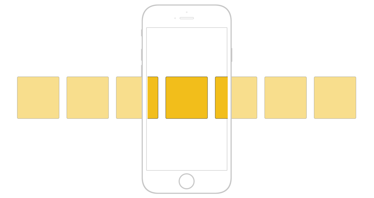
A retina-ready website delivers richer visuals that are ready for the ever-increasing specifications of many devices. Many of Apple’s iMacs and Macbooks, along with current and previous generations of iPhone, have a retina display. This is a term used by Apple to describe a viewing experience by which users cannot discern individual pixels at a normal viewing distance, achieved through a high resolution and pixel density. Marketingland reports that over 52% of all mobile internet traffic is driven by Apple iPhones, meaning the true figure of all retina devices, including laptops and desktops, is much higher.
So what does this mean for your website? It is simply a matter of ensuring that users that reach your website on a device that is making use of a Retina display see everything as intended. By appearing clean, clear and crisp on the most advanced devices you can be sure that your website works well across the range of available displays.

Simplify User Experience
User experience dictates everything in current design and as such ensuring that the layout of your website is as simple as possible is a must. Removing barriers and clicks in a user’s journey from your homepage to a given desired destination is a must with modern design.
Creative Director Enzo Case said of user experience, “The simpler you can make the journey for users to access your content the better. Many websites or applications try to throw information at you all on the homepage, but the better experience for the user is to break the content up into rationalised pieces.”
Bold And Simple Design
In 2013, ‘flat’ design aesthetic exploded onto the scene and pushed back against the older design method called ‘skeuomorphism’ which aimed to reproduce real-world designs digitally. Flat designs embrace the limits of digital experience by using block colours and doing away with shading that was used previously to make things look three-dimensional.
This style of design is not only ‘of the moment’ but has a practical application in providing an intuitive experience. NN Group revealed that visitors to any site need to know about you and your company in 10 seconds or less, or else they will leave entirely. Flat design curbs this drop-off rate by reducing the visual information provided by aesthetics, there-by allowing content to shine through.
Far from limiting the enjoyment of your site, or appearing boring, flat designs are incredibly popular. Get people where they want to be while providing a beautiful environment, win-win!
Roll And Scroll
Following on from the previous point, many websites are providing a fluid system for navigation that lets users experience the site in a specific order, should they not have a specific destination in mind. This is achieved through the use of longer pages, through which a visitor will scroll, divided into individual sections.
Through the use of images, video content and diagrammatic representations this design option provide clear and easy navigation to all users. This change has been made to steer away from older style drop-down menus, which can be difficult to navigate through on a mobile device. These same menus cause frustrations on desktops, as revealed in a usability study by the NN Group. These trials proved that users move their eyes quicker than their mouse, and the delay between deciding to use the navigation and the full list of options is a point of annoyance.

Slide-Out Menu
While our last point provided a solution for the many woes of older drop-down menus, there is still hope for making the most of every inch of digital real estate. Slide-out menus are beneficial to both mobile users and provide a less frustrating experience than a drop-down on desktop.
Google, YouTube and Spotify all make use of slide-out menus, making navigation less intrusive by moving content aside temporarily to interact with the options on offer. This means nothing is covered over and the navigation is hidden entirely until a user calls for it.
Combining this with a well-planned and executed design grid will give a sense of the way the website flows. Arranging your content, and even your navigation tools, in a way that users expect means that your message can be consumed faster, which will reduce bounce rates and increase conversions across the board!


/https%3A%2F%2Fassets.over-blog.com%2Ft%2Fcedistic%2Fcamera.png)
/image%2F3869246%2F20210225%2Fob_21448a_seo-optimise.jpg)
/image%2F3869246%2F20210225%2Fob_1184de_freelance-designer.jpg)
